Research · 2026-09-29 · 9 min read
Does Lorem Ipsum Look Like English? We Measured It

Software Engineer, architect, and systems designer
Software Engineer with over 10 years of industry experience, working across architecture and system design. Builds Lorem Genius under Ashika Labs.
Nearly every explanation of Lorem Ipsum, including some on this site until recently, makes the same claim: the Latin has a letter and word-length distribution close to English, so it gives a realistic impression of how real copy will look. It's repeated so often that nobody checks it.
We checked it. The short version: on width, the claim holds up well. On letter shapes, it doesn't. And the themed alternatives, which look like the safer choice because they're English, are further from real English on width than the Latin is.
What we measured, and against what
For English, we used two samples with deliberately different registers:
- Encyclopedic prose: eight English Wikipedia articles (Typography, Web design, Graphic design, User experience design, Software documentation, Printing, Coffee, Baking). 32,550 words. This is the closest match to the explanatory copy most websites run.
- Narrative prose: the full text of Pride and Prejudice from Project Gutenberg. 122,623 words.
Against those, we measured:
- The canonical Lorem Ipsum paragraph ("Lorem ipsum dolor sit amet… id est laborum"), 69 words.
- Cicero's original Latin: Book I of De finibus bonorum et malorum, from The Latin Library. 7,164 words. This is the text Lorem Ipsum was scrambled from.
- The six word banks this site's generator draws from: standard, hipster, cupcake, Gen Z, corporate and bacon. These are the 15 source sentences behind each style, 116 to 161 words each. They're small, and we'll come back to what that means.
Word length is counted in letters only, ignoring punctuation. Rendered width was measured in Chrome using the canvas measureText API. For each sample we measured every word plus its trailing space in Arial, Georgia, Verdana, Times New Roman and Segoe UI at 16px, and averaged to get the width of 100 words.
Finding 1: Lorem Ipsum is almost exactly as wide as English
This is the property that matters most for layout: if you fill a column with 100 words of Lorem Ipsum, does it take up the same space 100 words of real copy would?
| Sample | Mean word length (letters) | Width of 100 words vs English, Arial | Georgia |
|---|---|---|---|
| English, Wikipedia | 5.25 | baseline | baseline |
| English, novel | 4.41 | −13.1% | −12.9% |
| Canonical Lorem paragraph | 5.35 | — | — |
| Standard Lorem Ipsum (generator bank) | 5.47 | +3.0% | +3.8% |
| Cicero's original Latin | 5.62 | +6.4% | +7.1% |
| Hipster ipsum | 6.55 | +21.2% | +22.5% |
| Cupcake ipsum | 6.02 | +14.5% | +14.1% |
| Bacon ipsum | 6.03 | +11.6% | +12.7% |
| Corporate ipsum | 4.89 | −7.7% | −7.1% |
| Gen Z ipsum | 4.63 | −10.5% | −10.1% |
(The canonical paragraph is too short to give a stable width figure, so we measured width on the generator's standard bank, which contains it.)
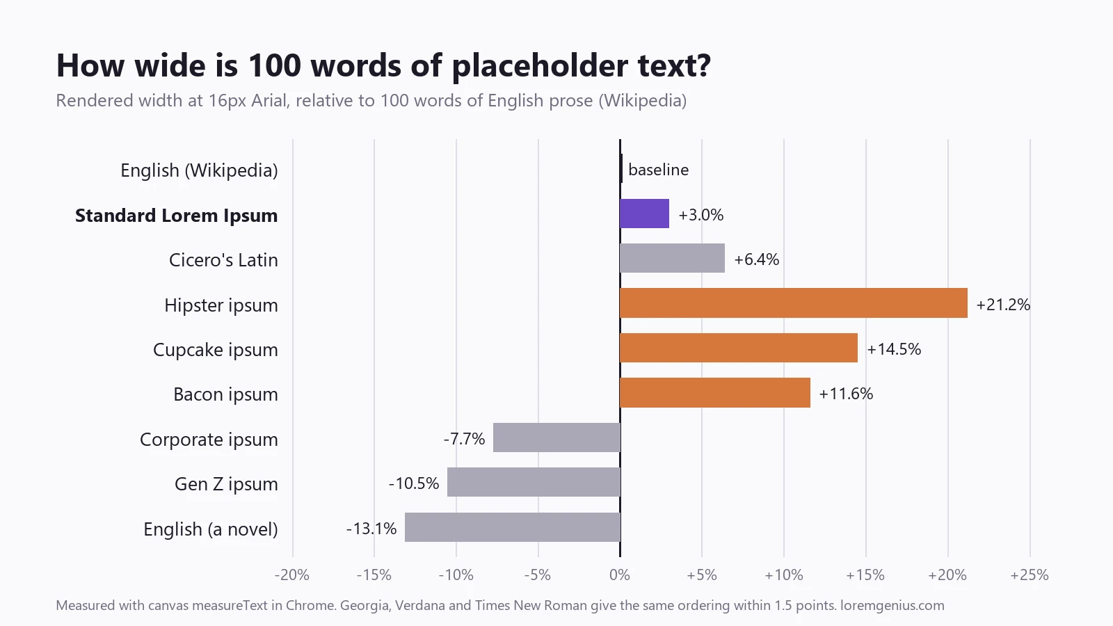
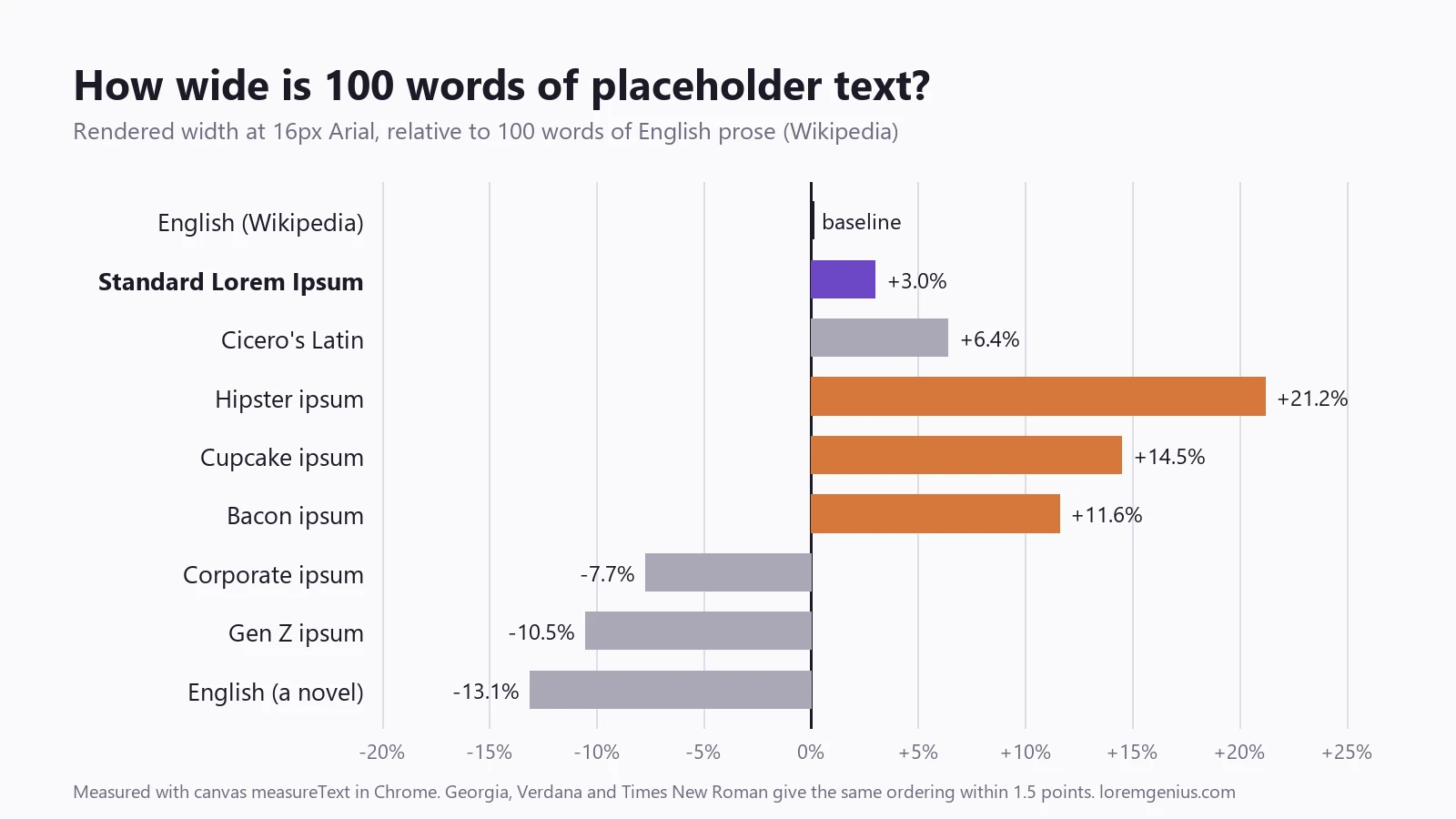
Standard Lorem Ipsum lands within 4% of encyclopedic English in every font we tried. Verdana, Times New Roman and Segoe UI gave the same ordering as Arial and Georgia, with every style within 1.3 points of its Arial figure. That is a closer match than we expected, and it's the strongest argument for the Latin: as a stand-in for how much room copy takes, it's genuinely good.
Two things qualify it.
"English" isn't one width. The novel runs 13% narrower than the encyclopedia, because narrative prose leans on short words: he, said, was, not, her. 46% of the novel's words are three letters or fewer, against 35% of the Wikipedia text. If your product's copy is conversational (onboarding, chat, notifications), Lorem Ipsum overstates its width by about 15%. If it's technical or explanatory, Lorem Ipsum is close to spot on.
The themed variants are worse, not better. It's tempting to assume that because hipster or cupcake ipsum is English, it approximates English better than Latin does. On width it's the reverse. Hipster vocabulary (scenester, lumbersexual, williamsburg) is so front-loaded with long words that a third of them run eight letters or more. 100 words of it takes 21% more room than real English. Design a card around hipster ipsum and your real copy will look sparse in it.
Gen Z and corporate ipsum sit on the narrow side, closer to conversational English. Corporate is full of the, to, and, we: 41% of its words are three letters or fewer, which is why it reads so plausibly as real B2B copy.
Finding 2: The letters are not like English at all
Here the usual claim falls apart. Lorem Ipsum's letter mix is Latin's, and Latin distributes letters very differently from English.
The biggest differences:
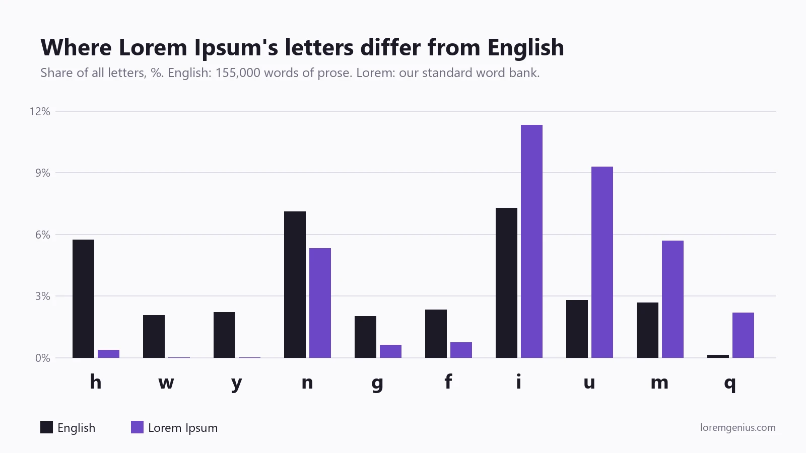
- h is the ninth most common letter in English (5.7% of all letters) and nearly absent from Lorem Ipsum (0.4%). That takes out th, sh, ch and wh, the most frequent letter pairs in English, and with them a lot of tall strokes.
- u is more than three times as common (9.3% vs 2.8%), i half as common again (11.3% vs 7.3%), m twice as common, and q about eighteen times as common.
- w and y don't appear at all.
Summed across the alphabet, the letter shares differ by 38 percentage points. That's as far from English as Cicero's unscrambled Latin (37.7), which makes sense: the scrambling moved words around, not letters.
Why a designer should care: ascenders. Letters with tall strokes (b, d, f, h, k, l, t) are 24.9% of the letters in the Wikipedia text and 27.8% in the novel. In the standard Lorem Ipsum bank they're 19.0%: between a quarter and a third fewer.
Ascenders are what make a paragraph's top edge look busy, and what collide with the descenders of the line above when leading is tight. A block of Lorem Ipsum is visibly smoother and lower than the same block in English, dominated by x-height letters like u, i, m, n. Line height that looks comfortable in Latin can look cramped in English. If you're setting leading tightly, check it with real English before signing off.
Descenders (g, j, p, q, y) are closer: 5.8% in Lorem Ipsum against 6.1–6.9% in English. Of the themed banks, cupcake has the most descenders at 8.5% (jujubes, lollipop, pudding, gummies), which makes it a reasonable stress test for tight leading from the other direction.
Finding 3: The canonical paragraph never shows you five letters
We checked which letters of the alphabet each sample contains at all.
| Sample | Letters never used | Digits | Accented letters |
|---|---|---|---|
| Canonical Lorem paragraph | j, k, w, y, z | none | none |
| Standard generator bank | j, k, w, y, z | none | none |
| Cicero's original | j, w | none | none |
| Hipster | j, z | none | none |
| Cupcake | x | none | yes (dragée, soufflé) |
| Bacon | q, x, z | none | none |
| Corporate | z | none | none |
| Gen Z | j, q, x, z | yes | none |
If you're evaluating a typeface in Lorem Ipsum, you never see its w, often the widest and most awkward lowercase glyph. You never see its y or j, whose descenders interact with line height. You see no numerals, so nothing tells you whether the figures are lining or old-style, tabular or proportional. And there's no accented character to show whether tight leading clips an é against the line above.
The only punctuation in the canonical paragraph is commas and full stops: no apostrophes, quotation marks, dashes or colons. Those are the characters most likely to reveal bad kerning or straight quotes where curly ones belong.
The fix is cheap: put a pangram, a line of figures and a few accented names next to your placeholder block. Typography testing with placeholder text has a fuller checklist.
Finding 4: Some word banks are smaller than they look
Each style in this generator draws from 15 source sentences. How varied that feels depends on how many distinct words those sentences use.
| Style | Words in bank | Distinct words | Most repeated |
|---|---|---|---|
| Hipster | 122 | 112 | fixie ×3 |
| Corporate | 161 | 114 | the ×12 |
| Standard | 152 | 111 | aut ×6 |
| Gen Z | 131 | 89 | it's ×5 |
| Bacon | 116 | 71 | pork, beef, ribs ×5 |
| Cupcake | 123 | 62 | cake ×7, chocolate ×6 |
Cupcake is the least varied: barely half its words are distinct, and cake, chocolate, sweet roll and candy recur constantly. That's fine for a card or a hero. Across a full-length article layout the repetition becomes noticeable, and it's the thing that makes a mockup feel fake. For long-form layouts, standard or hipster keep the texture more even.
We found this while writing this post. It's a limitation of our own generator, and we'd rather tell you than have you discover it in a client review.
Finding 5: Our sentences are shorter than real ones
One more honest result. The generator's sentences average about 8 to 11 words, depending on style. The Wikipedia text averages 18.8 words per sentence, and the novel 21.3. Even the canonical Lorem paragraph averages 17.
Short sentences mean more full stops and more capitals per line. Mostly this doesn't matter, because a sentence boundary is nearly invisible in a block of text. It does matter if you're judging how a paragraph ends: shorter sentences give you more short last lines ("runts"), which can make a layout look more ragged than real copy would. If paragraph endings are part of what you're evaluating, generate by paragraph rather than by sentence, and check against a real paragraph.
What this means in practice
- For sizing (how much room copy takes), standard Lorem Ipsum is a good proxy. It's within 4% of explanatory English. For conversational copy, expect real text to take about 15% less room.
- Don't use themed ipsum to size things. Hipster, cupcake and bacon run 12–21% wider than English. Use them for tone, not for fitting text into a card.
- Don't finalize line height in Latin. It has a quarter to a third fewer ascenders than English, so tight leading looks better in Latin than it will in production.
- Don't evaluate a typeface in Latin alone. You won't see j, k, w, y, z, any numerals, any accents, or most punctuation.
- For conversational interfaces, the narrow styles are closer. Gen Z and corporate ipsum sit 8–10% narrower than encyclopedic English, near where chatty product copy lands.
Limitations
Worth stating plainly:
- The generator banks are small (116–161 words). Word-length averages over samples that size move by a tenth of a letter or so if a single sentence changes. The ordering between styles is stable; the second decimal isn't.
- Width was measured on system fonts on one Windows machine. Webfonts with different proportions will shift the numbers. We'd expect the ordering to hold, because it follows directly from word length.
- Two English samples aren't "English". Marketing copy, UI strings and legal text each have their own profile. Measure yours if it matters: the method below takes a few minutes.
Measure your own copy
The core of the width measurement is a few lines you can paste into any browser console:
// Average rendered width of 100 words, in px, for a given CSS font
function widthOf100Words(text, font = "16px Arial") {
  const ctx = document.createElement("canvas").getContext("2d");
  ctx.font = font;
  const words = text.split(/\s+/).filter(Boolean);
  const total = words.reduce((sum, w) => sum + ctx.measureText(w + " ").width, 0);
  return (total / words.length) * 100;
}

widthOf100Words(yourRealCopy) / widthOf100Words(yourPlaceholder);
Run it on a few paragraphs of your product's real copy and on whatever placeholder you're designing with. If the ratio is far from 1, your placeholder is misleading you about space.
To generate the samples, the generator produces any of the six styles by word count, so you can match lengths exactly.